.png)
What to do with a product that everyone loves to hate?
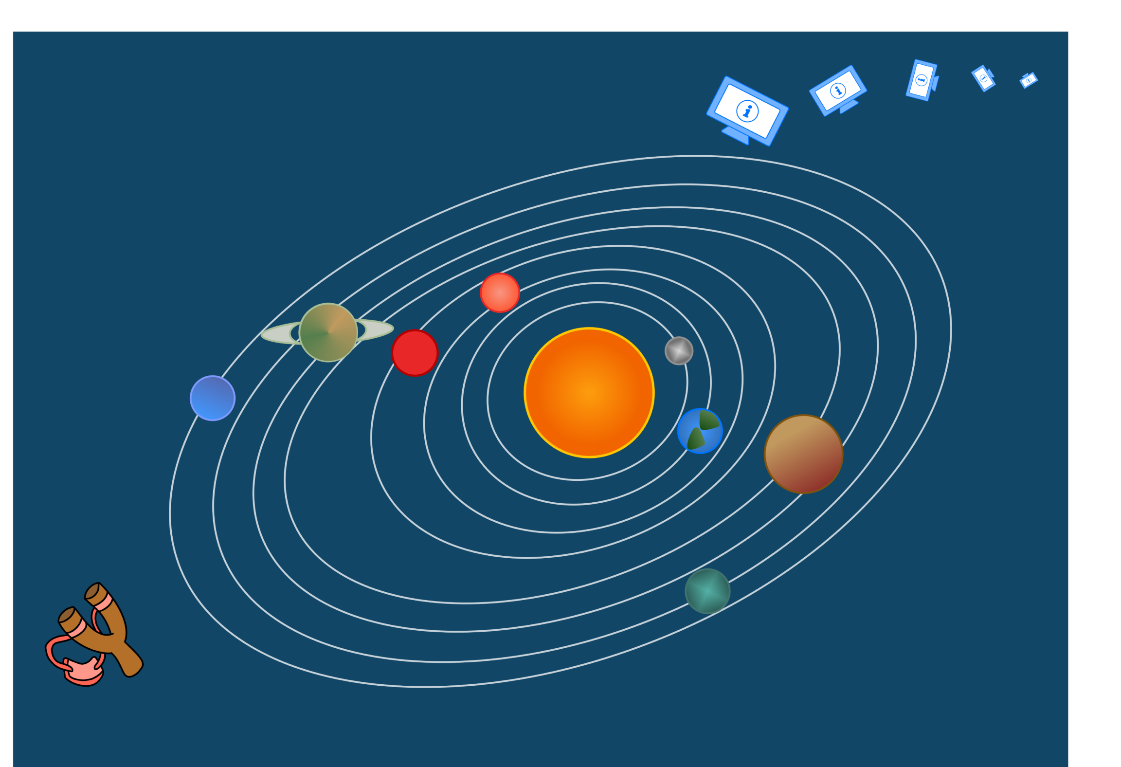
“Might I suggest propelling it out of the solar system to make sure it never returns again?”
- a disgruntled user
.png)
Redesign search page
Product manager
Developers
Background
‘Get IT Help’ was built to help over 10,000 employees resolve their IT issues. Instead, it had become a source of frustration and was universally disliked. The platform contained information on 600+ IT products, but the content varied in both quality and completeness. Users searching for solutions often hit dead ends, leaving them more confused than when they started.
The IT department wasn’t just facing a usability issue—it was dealing with growing customer dissatisfaction. Listening to consistent frustrated feedback, leadership knew something had to change. With limited resources, their initial ask was simple: improve the look and feel.
But as an advocate of user-centred design, I saw an opportunity to go beyond aesthetics. As the sole designer on this project, I was excited to take the lead in creative direction (within the constraints of our design system and style guides, of course). As an end user myself—I knew first-hand the pain points and inefficiencies.
I set out to transform a confusing process into an intuitive experience.
The goal? Increase customer satisfaction and reduce the load on IT support teams.
Process
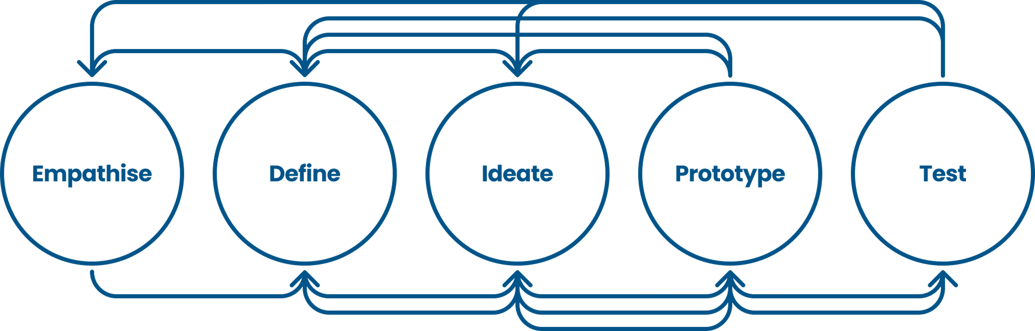
I use the Design Thinking framework as a foundation: empathise > define > ideate, prototype, test - always beginning with user and client empathy. From there, the process is rarely linear—it’s a dynamic journey, often looping back before moving forward, as shown in the diagram below. While much of this project centred around the ideate and prototype stages, user interviews revealed new insights, prompting a return to empathise to deepen our understanding. Similarly, fresh requirements emerged later in the process, leading to further iterations in the ideate and prototype stages.
Research
The IT department approached our product team because they knew users were frustrated and their IT support teams were stretched. As a user myself, I had first-hand experience with some pain points, but I wanted to go deeper. What was really making the experience so frustrating?
I began the empathise stage, starting with a UX expert review, this included:
- Heuristic analysis using Nielsen’s 10 usability heuristics
- Accessibility audit to ensure inclusivity
- Comparison with existing user feedback to spot recurring issues
The product was designed to help users self-serve before reaching out to IT support—so why were they still struggling to find what they needed?
Users were overwhelmed by receiving hundreds of search results—yet on Google, we barely blink when we get millions. Why?
Why didn’t the product work like a standard help centre?
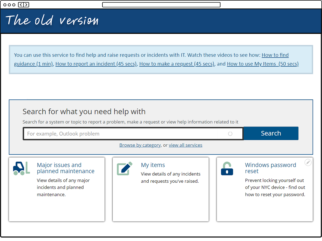
Digging into feedback forms confirmed my suspicions. The homepage featured a large search box and little else, an approach that works for Google and other help centres—but our users didn’t trust our search. They weren’t confident they were in the right place and felt stuck in an endless loop of searching and second-guessing.
To understand what makes a truly effective help centre, I analysed countless examples, ranging from small collections of fewer than 50 articles to complex systems with over 500. I focused on help centres for intricate platforms like Zendesk and technical tools like Zoom.
A few key themes emerged:
- Complex products need strong categorisation and high-quality content
- All help centres rely on a powerful search system with clear, reliable results
The UX problem as old as time
The problem was clear— and it’s the same issue that’s at the heart of almost every bad user experience. The user’s mental model of the product just didn’t align with the IT department’s. Mental models are the assumptions, beliefs, and expectations users have about how a system should work, based on their past experiences with similar products.
To IT, the journey was obvious. But for users, it was anything but. They hit dead ends, second-guessed their choices, and lost confidence in the process.
Since changing the product’s structure and content was out of scope, my goal was to shift the user’s mental model—guiding them toward what IT had in mind all along. Closing this gap between user expectations and system logic was my focus, starting with the homepage and search results page, where the disconnect was most apparent.
More is more
For the homepage, more is more.
The original homepage was stark. Its main feature—a large search box—felt redundant because users simply didn’t trust the search function. Without guidance or clear entry points, they were left guessing.
Going into the ideation stage, I knew the new homepage needed to do more. It had to offer clearer options and guide users toward self-serving effectively.
The product had two key types of pages:
- Support articles – instructional content providing guidance
- Product/service pages – offering key links to report issues and submit requests
However, users didn’t understand the difference. Faced with a choice, they guessed blindly—often leading to frustration and wasted time.
Another challenge emerged: low learnability. Research from previous projects revealed that users didn’t visit the product often enough to remember how to use it. When they got stuck, they relied on colleagues rather than the system itself.
With these insights in mind, I sketched out multiple homepage concepts, each designed to reduce uncertainty and improve guidance.
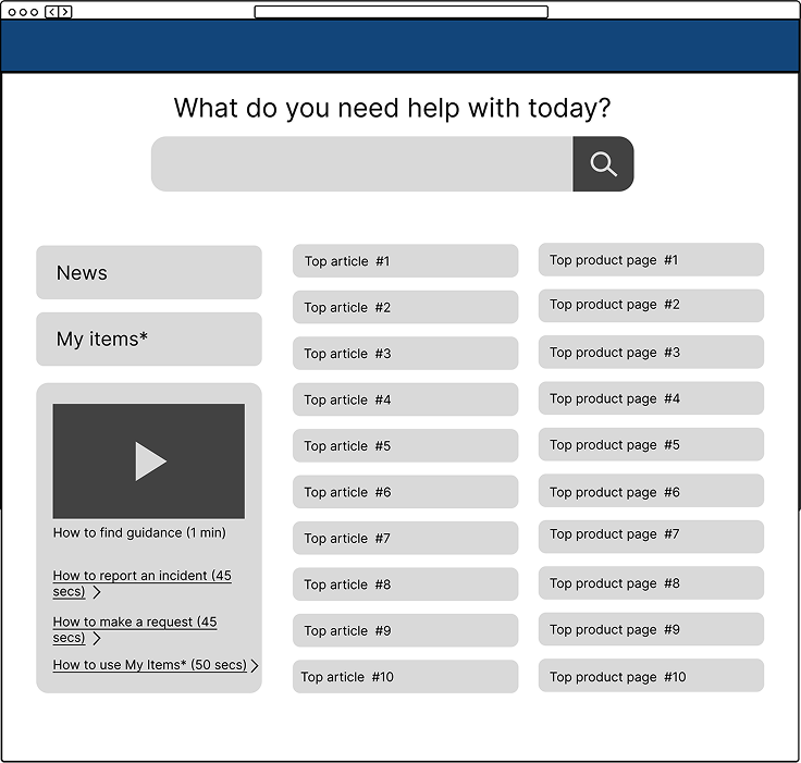
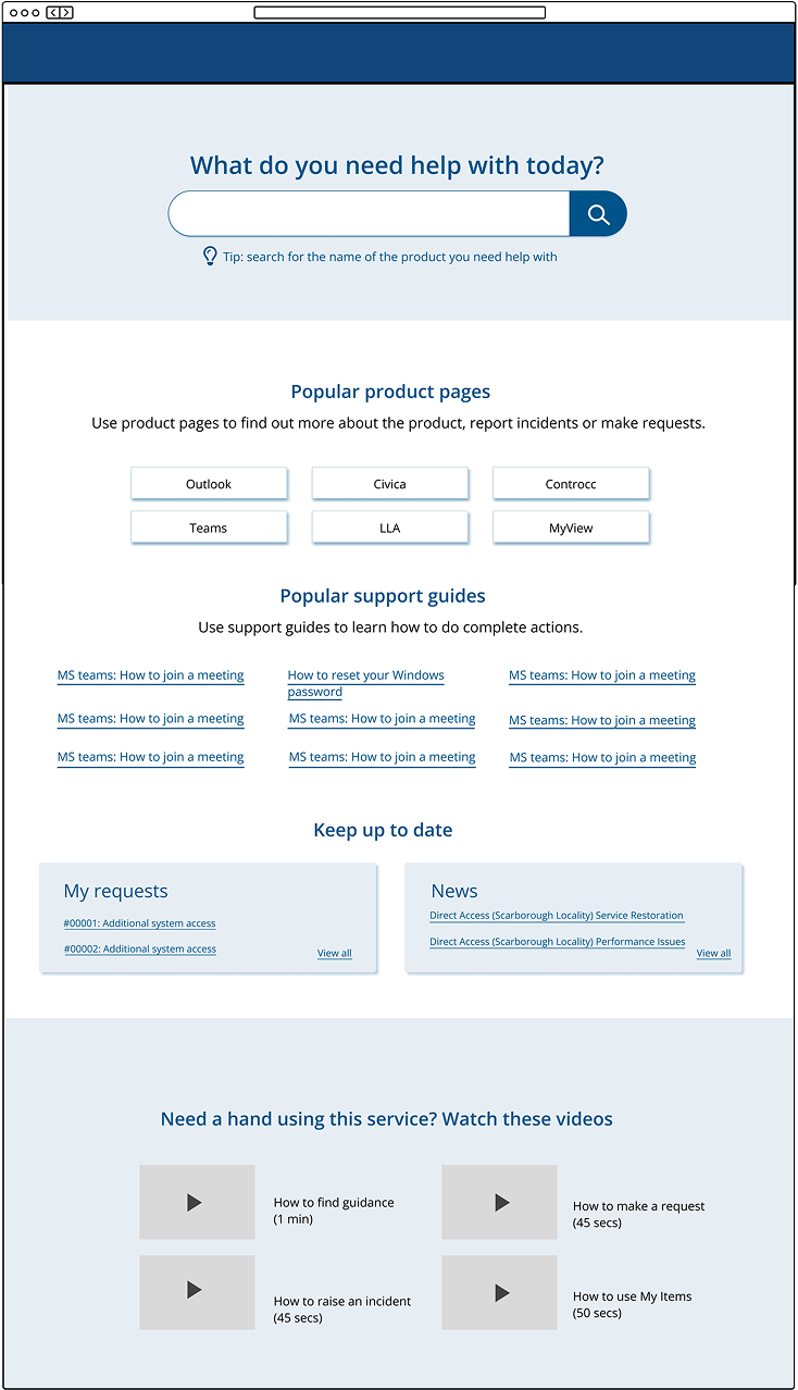
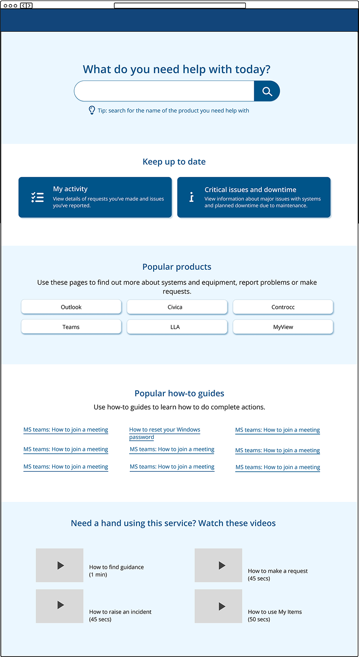
We ultimately settled on the final design. It introduced popular sections to encourage exploration. Short descriptions provided immediate clarity, helping users understand what they were selecting.
I also focused on language, recognising its power in shaping usability. The original terminology was confusing:
- ‘Product and service pages’ could be mistaken for public services (a common term in local government). I simplified this to ‘Product pages.’
- ‘Support articles’ sounded technical and vague. I rebranded them as ‘How-to guides’—a friendlier, more intuitive label.
A note on accessibility
Accessibility is a top priority for this project, and all digital products in this local government. It’s baked into our design system ensuring that any redesigned elements are inclusive for all users and meet WCAG 2.2 guidelines.
From a technical perspective, this means that all elements must be fully accessible using assistive technologies. From a design perspective, considerations included colour contrast, copy clarity, sizing, heading structures, link text, and icon usability—all carefully evaluated to enhance accessibility and inclusivity.
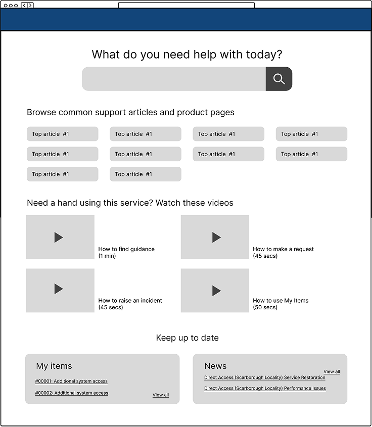
Rebuilding trust in the search results
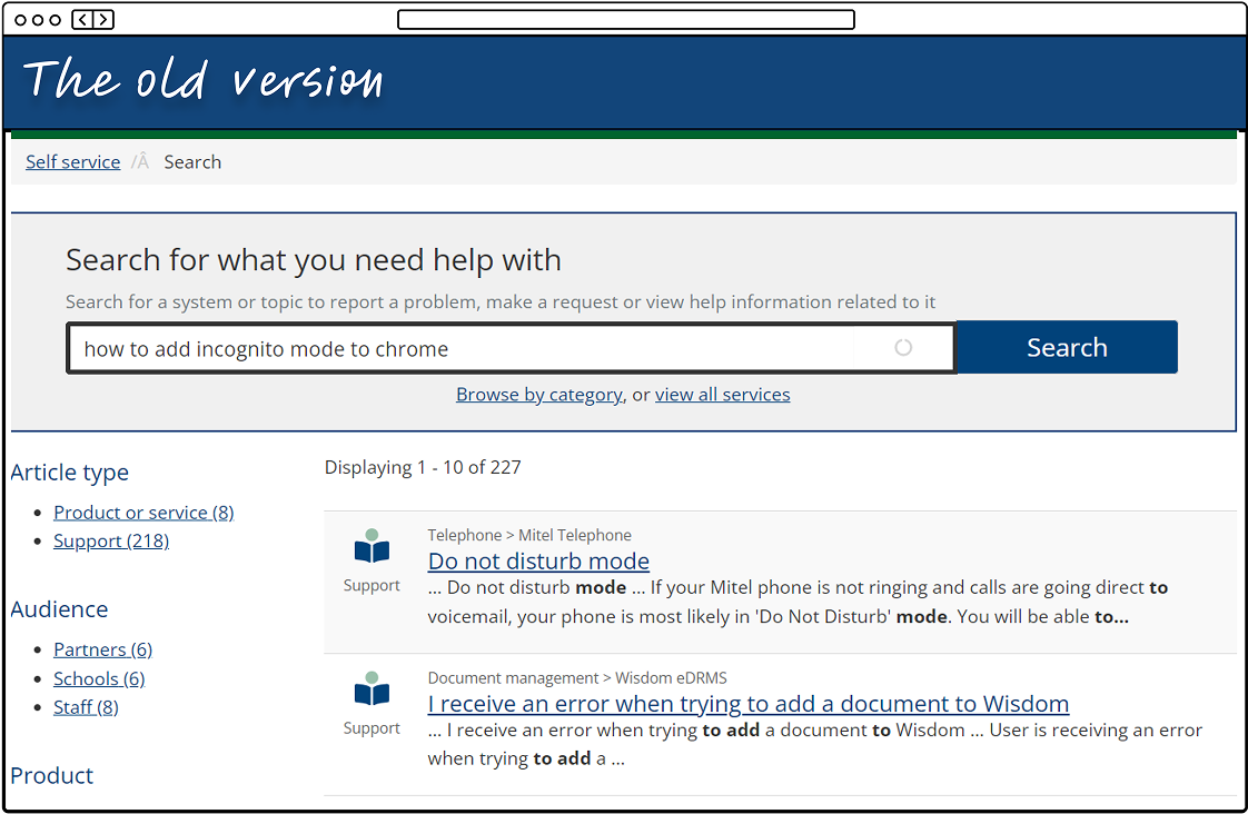
Continuing with the ideation phase, it was time to look at the search results page. The main issue with the search results page wasn’t just its (slightly outdated) design—it was user confidence. Even when the results were relevant, users didn’t trust them.
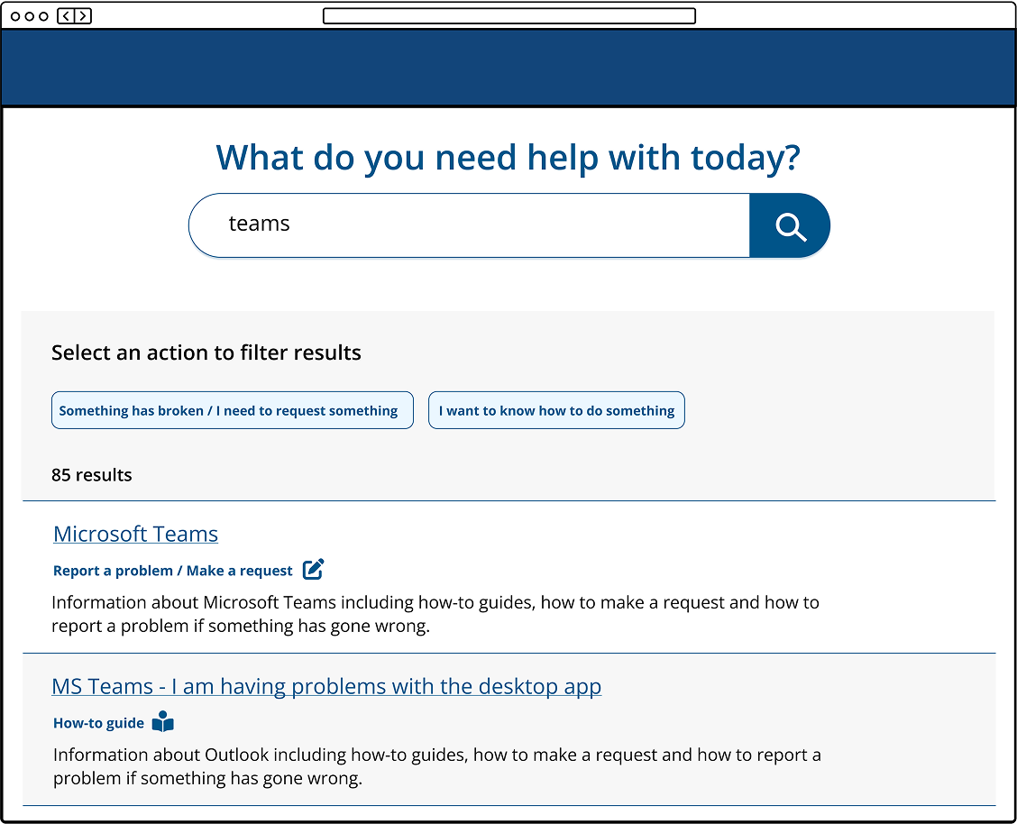
To fix this, we needed to remove clutter, improve clarity, and guide users toward informed decisions. My approach focused on three key areas.
1. Helping users make smarter filtering choices
Analytics showed that search filters were rarely used, likely because they didn’t make sense to the average user. Instead of overwhelming them with unnecessary options, we removed all but two filters—then reworded them to align with both user expectations and business goals. The goal was to help users filter results based on the kind of help they needed, not just vague technical categories.
2. Clarifying what each search result actually meant
The original preview text lacked readability and didn’t give users a real sense of what each page offered. Instead of relying on auto-generated snippets, we introduced consistent, structured descriptions explaining what actions users could take on each page. Over time, we planned to refine these further with custom copy for each page, adding even more clarity.
3. Cleaning up the design to reduce distractions
We identified several visual elements that caused confusion rather than helping users navigate: Large left-hand icons indicated different types of articles, but users didn’t understand what they meant. We replaced them with small headings beneath each page title to clearly state the purpose of the page. Breadcrumbs above each search result reflected an internal IT categorization system that meant little to users. Removing them decluttered the page and made scanning results much easier. Excessive filter options were trimmed down to just the two most meaningful choices. These changes helped shift the search results page from a cluttered, untrustworthy experience into something clear, scannable, and confidence-building—guiding users to the right information without frustration.
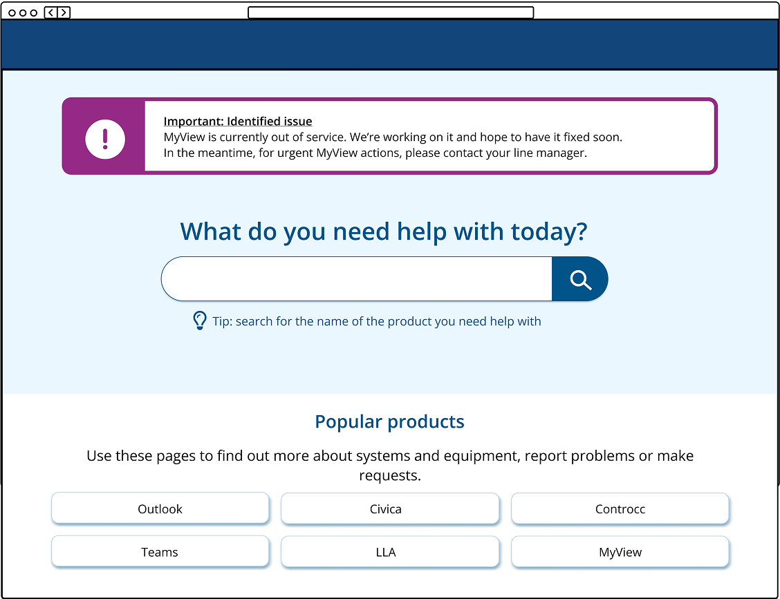
A new requirement
As we were preparing the prototype for testing, the IT department introduced a new requirement. Occasionally, a company-wide IT system would go down, and while staff were usually encouraged to report issues through the Get IT Help portal, mass outages were different. Rather than having hundreds of duplicate reports, IT needed a way to quickly inform staff when they were already aware of an issue and actively working on a fix. The solution? A homepage alert that IT could activate during major outages.
I explored several design options and eventually narrowed it down to two:
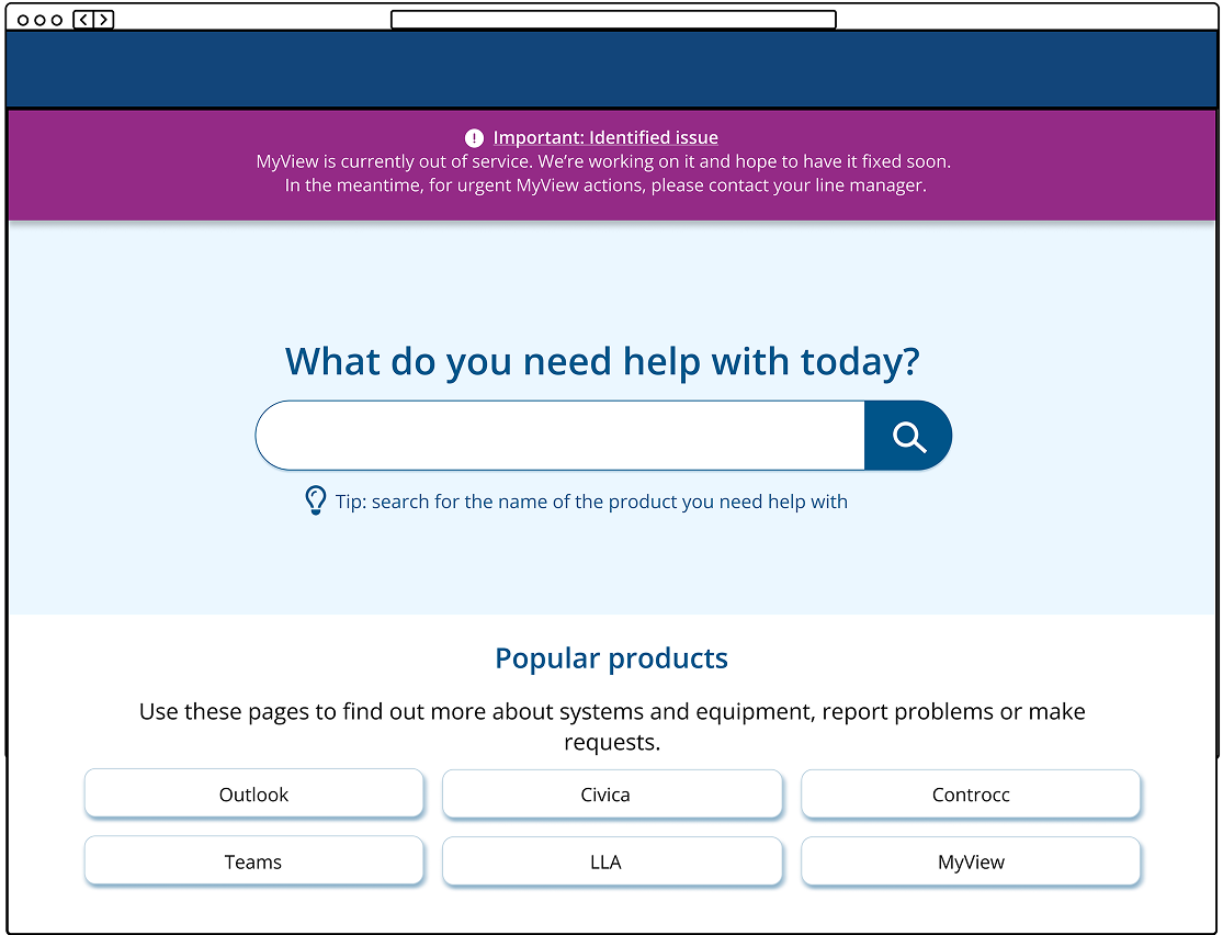
- Option A: Inspired by existing alerts and GDS (Government Digital Service) styles, this version featured a larger icon and a familiar corporate purple shade from our intranet.
- Option B: A more subtle, yet highly visible approach. This version used more colour and stretched full width across the top of the screen.
Put it to the test - from afar
A/B testing
To kick off the testing phase, I conducted unmoderated A/B five-second tests to determine which alert design was more eye-catching and informative.
Participants were shown the homepage with either option A or option B for five seconds. Afterward, they were asked: “What do you remember seeing on the page?”
The results were clear—option A significantly outperformed option B.
- 90% of participants noticed option A
- Only 60% noticed option B
Option A: responses
"The purple box telling me that there is an outage and to contact my Line Manager"
"MyView is currently out of service"
"The search bar. The information box at the top with an alert. Icons."
"The initial heading about myview, the screen moved to quickly for me to take anything else in"
Option B: responses
“what did you want help with today”
“the pink bar at the top. Not much of the rest”
“It was for ICT and there were about 6-8 options/boxes below about areas that you need help with”
“what do you need help with today - and some options - what if my option is not there?”
Heat maps
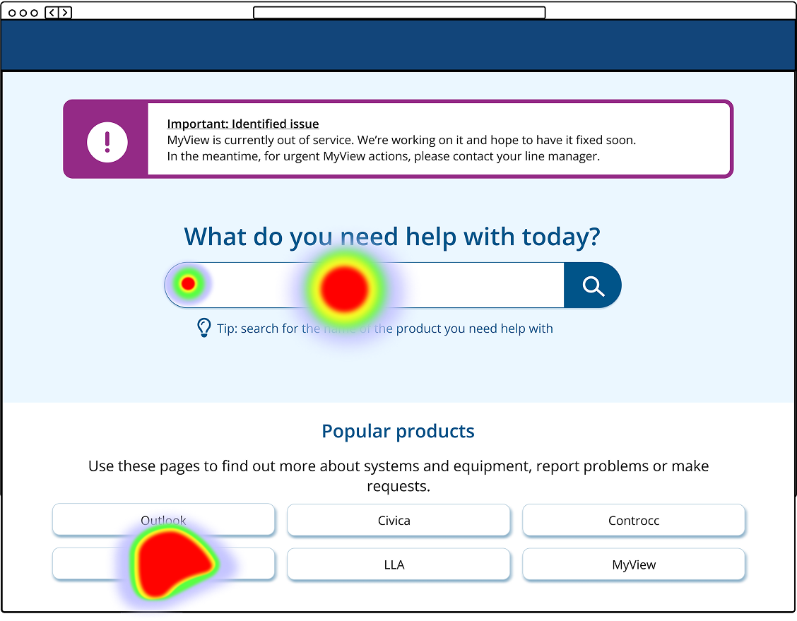
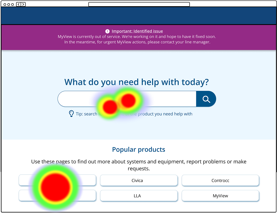
Alongside the testing the alert box styles, I also ran a light-touch usability test on the homepage to see how users would interact with the new design. Specifically, I wanted to know: Would users rely solely on the search bar, or would they explore other options?
Participants were shown the homepage and asked:
"Where would you go if you had a problem with Teams?"
As I had hoped, all participants either used the search bar or clicked the ‘Teams’ button in the ‘Popular products’ section (see heat maps below—the obscured button in the bottom left is ‘Teams’).
While this might not seem groundbreaking, it demonstrated that we could successfully guide user behaviour. In usability testing, participants often act unpredictably—so when they behave exactly as expected, it’s a rare (and satisfying) win. This was a strong indication that we were making meaningful improvements to how users navigate the product.
Put it to the test - watching up close
Impact
Using Google Analytics (GA4), I uncovered key insights that highlighted the impact of the redesign:
- Fewer ‘generic’ form submissions – Users were now finding the specific pages they needed instead of defaulting to the fallback form. This suggested they were resolving their issues independently rather than escalating them to IT— a strong indicator of improved usability and learnability.
- Increased use of search filters – Previously ignored, filters were now actively used. This showed that when filters are intuitive and meaningful, users will engage with them to refine their search.
- Lower bounce rate – More users were staying on the site and finding what they needed, rather than abandoning their search in frustration.
Beyond GA4, we also saw a small but meaningful increase in NPS (Net Promoter Score). Given that internal NPS tends to skew low—since users mostly leave feedback when something goes wrong—even a slight improvement indicated reduced frustration and a step in the right direction.
Learnings
One of my biggest takeaways from this project was the experience of leading every stage of the design process. Since this was a redesign, many elements couldn’t simply be pulled from our design system. While I ensured consistency by using our corporate colours and adhering to accessibility standards, I also had a level of creative freedom—with one major constraint: Drupal, our content management system (CMS).
Collaborating with the developer, we found compromises between design intent and technical feasibility. In hindsight, I’d prioritize understanding the CMS constraints earlier in the process to prevent rework. I’d also recommend updating our design system with these new components so future iterations align with the refreshed style and require less custom design work.
On the research side, this project highlighted the importance of building a structured research repository. The insights from moderated testing were valuable not just for this redesign but also for other products. Many findings reflected broader user behaviours and mental models, making them relevant beyond this project.
Having a centralised repository would allow these insights to inform future personas, user journey maps, information architecture decisions, and UX strategies. By systematically storing and organising user research, we could gain a head start on future projects, ensuring that past learnings continue to shape better experiences.